アニメーションしながら切り替わるスイッチをCSSのみで作るチュートリアル
Contents
【CSS3】アニメーションしながら切り替わるスイッチをCSSのみで作るチュートリアル
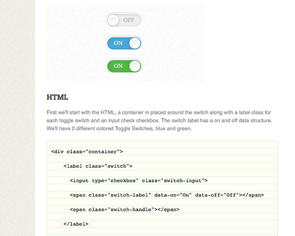
クリックするとオンとオフが切り替わるスイッチを、CSSのみで実装するチュートリアルがBLOOM WEB DESIGN(http://bloomwebdesign.net/)で紹介されていました。クリックするとフェードでふわっと背景色が切り替わり、スイッチハンドルが左から右へ移動します。
チュートリアルページはこちら
Create CSS3 Toggle Switches Tutorial
http://bloomwebdesign.net/2014/02/css3-toggle-switches-tutorial/
それでは、一つずつ見ていきましょう。
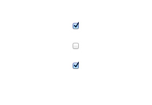
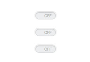
1.チェックボックスを作る
まずは通常のチェックボックスを3つ、タテに並べます。
HTMLでは、label要素の中に、input要素と、オン/オフ切り替え用span要素、スイッチハンドル用span要素を入れます。
◆HTML
/*CSS*/
.container {
margin: 50px auto;
width: 280px;
text-align: center;
}
.container > .switch {
display: block;
margin:20px auto 20px auto;
}
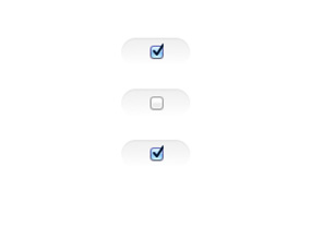
2.背景を作る
label要素の背景にグラデーションをかけ、丸いスイッチ状にします。
後でinput要素やスイッチハンドル部分と重ねるため、positionはrelativeにしておきます。
/*CSS*/
.switch {
position:relative;
display:inline-block;
width: 56px;
height: 20px;
padding: 3px;
background-color: white;
border-radius: 18px;
box-shadow: inset 0 -1px white, inset 0 1px 1px rgba(0, 0, 0, 0.05);
cursor: pointer;
background-image: -webkit-linear-gradient(top, #eeeeee, white 25px);
background-image: -moz-linear-gradient(top, #eeeeee, white 25px);
background-image: -o-linear-gradient(top, #eeeeee, white 25px);
background-image: linear-gradient(to bottom, #eeeeee, white 25px);
}
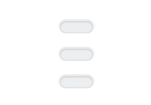
3.チェックボックスを非表示にする
input要素をopacity:0にして見えなくします。

/*CSS*/
.switch-input {
position: absolute;
top: 0;
left: 0;
opacity: 0;
}
4.オン・オフ用背景を作る。
部分にオン・オフ切り替え用の背景を作り、input要素に重ねます。
/*CSS*/
.switch-label {
position: relative;
display: block;
height: inherit;
font-size: 10px;
text-transform: uppercase;
background: #eceeef;
border-radius: inherit;
box-shadow: inset 0 1px 2px rgba(0, 0, 0, 0.12), inset 0 0 2px rgba(0, 0, 0, 0.15);
-webkit-transition: 0.15s ease-out;
-moz-transition: 0.15s ease-out;
-o-transition: 0.15s ease-out;
transition: 0.15s ease-out;
-webkit-transition-property:
opacity background;
-moz-transition-property: opacity background;
-o-transition-property: opacity background;
transition-property: opacity background;
}
5.切り替え用テキストを入れる
.switch-label:beforeで、スイッチオフ時のテキストをdata-offの値に設定し、.switch-label:afterで、スイッチオン時のテキストをdata-onの値に設定します。この段階では、デフォルトでoffになっており、onの文字は非表示になっています。
/*CSS*/
.switch-label:before, .switch-label:after {
position: absolute;
top: 50%;
margin-top: -.5em;
line-height: 1;
-webkit-transition: inherit;
-moz-transition: inherit;
-o-transition: inherit;
transition: inherit;
}
.switch-label:before {
content: attr(data-off);
right: 11px;
color: #aaa;
text-shadow: 0 1px rgba(255, 255, 255, 0.5);
}
.switch-label:after {
content: attr(data-on);
left: 11px;
color: white;
text-shadow: 0 1px rgba(0, 0, 0, 0.2);
opacity: 0;
}
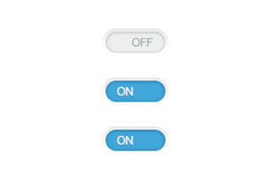
6.チェックが入った時のCSSを追加する
チェックが入った時に、labelの背景色を変更します。同時に、先ほど設定したオフ時の文字(data-offの値)を非表示にし、オン時の文字(data-onの値)を表示させます。
/*CSS*/
.switch-input:checked ~ .switch-label {
background: #47a8d8;
box-shadow: inset 0 1px 2px rgba(0, 0, 0, 0.15), inset 0 0 3px rgba(0, 0, 0, 0.2);
}
.switch-input:checked ~ .switch-label:before {
opacity: 0;
}
.switch-input:checked ~ .switch-label:after {
opacity: 1;
}
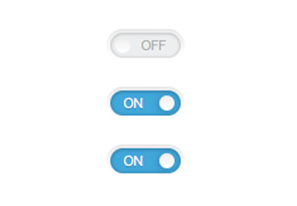
7.スイッチハンドルを追加して完成!
よりスイッチらしくするために、ツマミを描画します。オフ時は左側に、オン時は右側に表示されるように位置調整をしています。
本家チュートリアルページの通りにするとうまく表示されない、という場合は下記のように記述してみてください。
これで、スイッチの完成です!
/*CSS*/
.switch-handle:before {
content: '';
position: absolute;
top: 50%;
left: 22%;
margin: -6px 0 0 -6px;
width: 12px;
height: 12px;
background: #f9f9f9;
border-radius: 6px;
box-shadow: inset 0 1px rgba(0, 0, 0, 0.02);
background-image: -webkit-linear-gradient(top, #eeeeee, white);
background-image: -moz-linear-gradient(top, #eeeeee, white);
background-image: -o-linear-gradient(top, #eeeeee, white);
background-image: linear-gradient(to bottom, #eeeeee, white);
}
.switch-input:checked ~ .switch-handle:before {
left: 78%;
box-shadow: -1px 1px 5px rgba(0, 0, 0, 0.2);
}
8.オン時の背景色を変えてみる
背景色を緑にしたバージョンです。

/*CSS*/
.switch-green > .switch-input:checked ~ .switch-label {
background: #4fb845;
}
面倒なformまわりのデザインも、CSS3を駆使すればスマート。
今後、ぜひとも取り入れたいテクニックです。